RGB vs 4:4:4
 SnowSultan
Posts: 3,678
SnowSultan
Posts: 3,678
OK this is probably going to start a huge technical discussion but hopefully someone can chime in with a basic answer before it gets nuts. I'm already going nuts trying to get a new workspace in place (and I mean nUtS like 'ready to give up art forever' nuts), and I just can't sit and read though 600 pages of a calibration forum to possibly find an answer.
Is viewing a TV/monitor using an RGB color output format more desirable and accurate for artists than YCbCr444? Is a bit depth of 10 rather than 8 more important? I have a TV and a monitor that can give me either RGB or 444, but the colors on the TV change rather dramatically when I try switching between them.
Let's start with that and see where we go. :) Thanks in advance.
Daz 3D is part of 
Connect
DAZ Productions, Inc.
7533 S Center View Ct #4664
West Jordan, UT 84084
Licensing Agreement | Terms of Service | Privacy Policy | EULA
© 2025 Daz Productions Inc. All Rights Reserved.
Comments
I dont own a TV at the moment and the last one I did was a CRT.
All the monitors I have ever used were set to an RGB colour space cause the three primary colors of light are Red, Green and Blue.
Go with what works best for you.
Thank you, but my own personal opinion as to what looks right isn't good enough. I've had bad experiences with renders looking very different to others than they did for me, and I want to avoid that problem. Right now I'm looking at a render on both a monitor and a TV simultaneously and one is much more saturated and darker than the other.
In my experiences, I've found that computer text and small details look better when rendered in RGB.
In RGB each pixel on the screen is rendered with a dedicated address, whereas with 4:4:4 and the other YCbCr formats involve bandwidth saving measures that degrade the image quality.
All of your computer graphic work flow revolves around RGB, up until you convert to CMKY for printing on physical media.
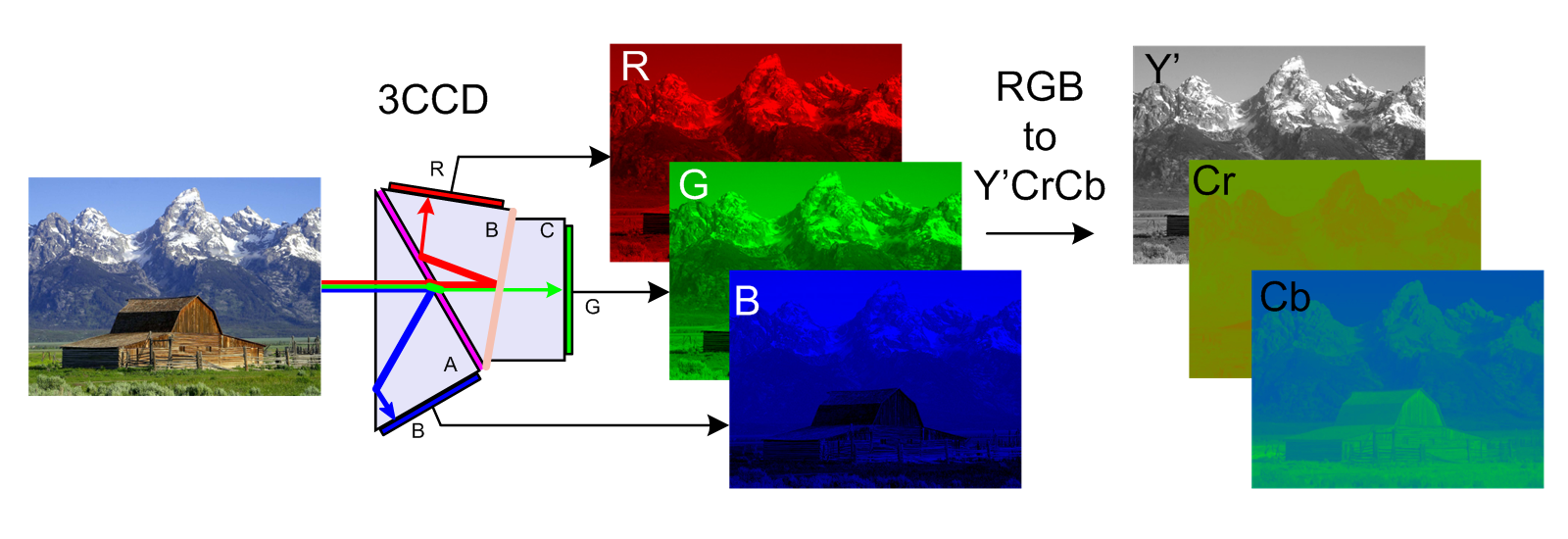
Here's an image from wikipedia showing how RGB and YCbCr break down the image into components for transmission between devices.
That's going to be an issue no matter what. The vast majority of people buy a monitor for the price rather than the technical specs, so unless you're only going to show people your work on the monitor you originally used in a room with the exact same lighting that was there when you created it, it's going to look different. As for TVs... they're designed first and foremost to show pictures quickly with minimal motion artifacts, with resolution and then color accuracy following in that order. Back in the days of standard resolution broadcasts, the common joke among engineers was that the NTSC standard stood for "Never The Same Colors." until you get to crazy prices, even individual monitors of the same model number will vary. And that's to say nothing of what happens when you post the images online. I've noticed that Deviant Art tends to give everything a little extra punch of vibrance when compared to something in the DAZ galleries, for example.
I find that devices like ipads and iphones tend to be calibrated quite well and will, imo, give a more "true" representation of how most will view the images - so is there a way you can look at an image on an ipad or iphone and the same image on your TV and adjust the settings until you get a similar look as what you're seeing on the iphone or ipad?
Thank you James for the information about the technical differences. Knowing that YCbCr is a bandwidth-saving format and derived from RGB makes me think that RGB is the way to go. I set my TV to RGB and have it looking fairly close to my monitor at the moment, and I'm going to call the TV's technical support tomorrow and ask about any recommended settings for PC use.
Thanks Cyber and Divamakeup too, I will definitely keep those thoughts in mind. It's funny that images always seem to look fine on my phone but not always on the primary devices I use to actually make them. ;)
Ig your TV has a "Game" mode, turn that on for your computer input.
This will turn off all of the extra image processing and should reduce the amount of input lag.
Below at the link is one monitor I ran across that is "affordable" and is geared towards serious artists.
The line is designed for artists and the reviews show that under tests their calibration show very precise standards in general.
(Downside is the input lag, so if you like more fast action-y games and are good at them, well meh...in this case for dual use of artist/gamer)
Never heard of a TV being used for anything related to making art. Not to say some don't. Really the TV's value would be to show what how others may see your art, which has value in itself.
This is the monitor link. Has some interesting descriptions in terms of artist standards.
I copied and pasted some excerpts below.
Even if you aren't looking to buy anything, think this artist oriented monitor product description will give you some key answers for current trending standards.
And, If your target audience is the consumer, I would guess 8 bit is going to fine still for a long time.
https://www.benq.eu/en-uk/monitor/designer/pd2700q.html
""Devoted to meet the latest professional color standard, BenQ has developed AQCOLOR technology to uphold the concept: “Accurate Reproduction". BenQ has invited a color expert to lead the team, and also actively participated in ICC (International Color Consortium) and ISO (International Standard Organization) to establish color-related standards and implementation.
Reference-Grade Color Performance with 10-Bit , 100% sRGB and Rec. 709
Covering 100% of sRGB and Rec. 709 color spaces, PD2700Q’s advanced IPS wide viewing angle technology minimizes color shift to inspire absolute design confidence. 100% sRGB color gamut accuracy adheres to industry standards in digital production, and Rec. 709 reproduces accurate resolution, frame rate, color gamut, gamma, and white point performance in high-definition video work.
Professionally Factory-Calibrated for Exacting Color Accuracy
Each BenQ Designer Monitor is individually factory-calibrated upon production to assure precise Delta-E and Gamma performance. Calibration results are validated against industry color standards to deliver the truest and most representative view of original content.""
If you do any post processing and/or print work you will want to check that your Photoshop color space is also set to the correct RGB space and you are using the correct preview space as well. You can set up multiple monitor calibrations as well as multiple colorspaces in PS to work in.
Color settings is under EDIT>Color Settings on the top bar and the preview space is set by going to View > Proof Setup and choosing Monitor RGB which will use your monitor settings - close enough for regular RGB on the web if you have calibrated your monitor correctly.
You can toggle this preview on and off using Command (or control) Y so you can WORK in RGB, but SEE in CMYK. Very useful for professional color correction.
For example, I tend to do a lot of print work which is printed in China. So my color settings are set to Europe General 3, sRGB for RGB images, FOGRA039 for CMYK and 15% gain for B&W images. This conforms to my Chinese printer's specs. And I use the Proof Setup set to CMYK so I see my work in CMYK "generally" even before I convert it so I can make good choices about what I'm doing.
In America however, I would be using something like North American General 2, sRGB for RGB and US Web coated SWOP 2 for CMYK and 20% gain for B&W. Those are pretty safe general settings for commercial print jobs. If you are just printing at home or only on inkjets I would leave it RGB and let the inkjet handle the conversion and try to adjust my monitor to match if that's what I was going for was just home prints. That's what I do when I print on a nice borderless printer at home and its wonderful.
^^ This^^
ETA: And this is why you need to try to color correct by the numbers and let your head get used to judging based on that until you trust yourself. And then STILL do it basically by the numbers. Plus a nice round of proofs straight from the actual high end printer until you are dialed in mentally and technically. And then every press is different, depending on who's running it on which day. Lots of fun!
I once had a person say to me... "I need a new monitor. This one is too dark." As if it didn't have any settings at all, software or hardware. ::blink blink::
I'm assuming that you are approaching this as a content creator. As a creator, you don't ever want to work in 8 bit color if you don't have to. All other factors being equal, always choose 10 bit over 8 bit for creating artwork. 10 bit gives you a much wider palette of colors to work with. This is important even if your target audience will be mainly using 8 bit monitors because color grading or editing in Photoshop and other softwares rely on high bit depths to give smooth gradation of colors. With 8 bit, you will experience ugly banding because of lack of colors. Always edit in 10 bit or higher, then optimise for 8 bit for your audience. 4:4:4 is important to filmmakers as a high-quality format for recording video to a medium such as SD or SSD. I'm not sure what it would mean for a Daz user. Probably nothing. I have never heard of a situation where a 3d artist had to be concerned about 4:4:4 video.
OK, some technical details that need to be addressed.
8bit RGB versus 10bit, You should certainly set your monitor for 10 bit. Just don't expect to get output from PS and DS or anything else in 10bit unless you have a Quadro or Radeon Pro GPU. That's one of the limitations imposed by the GPU makers to get people to buy the pro cards. Your display will show 10bit images produced elsewhere but the driver for the card will not let you output 10bit yourself. The difference between 8 bit and 10bit is not that noticeable in reality. The human eye just cannot tell that much difference between a color range of 16.7 million colors and 1 billion colors.
Monitor color calibration, if you create print media you want a calibrated monitor and you want to calibrate it on a regular basis. If you strictly do digital images you want one as well but it isn't vital. As long as your colors are close to true you're fine. The fact of the matter is that the majority of monitors that will be used to view your images won't be calibrated so the exact appearance of your image will be out of your control.
You need two things; an accurate monitor; a tool to calibrate the colours of the monitor.
It wont stop you'rs looking different, but yours will at least be accurate. Not your responsibility, and is impossible, to ensure it looks good of everyone elses. If your colours are correct it is up to others to match their monitor as closely as possible.
The better the Pixel Pitch the better the view no matter the resolution, but your screen needs to be calibrated even if everybody else's screen isn't. If someone then says that the image is too dark/light then you can tell them they need to calibrate their monitor as it is their monitor that is wrong and not your image.
And then you have to factor in the fact that a lot of Monitor (and TV) manufacturers are very deceptive in the specs they give. Then again, that's pretty much true across the elctronics industry these days. :/
Thanks to everyone for the very detailed and informative responses. I did know a little more about this than I might have appeared to (like Photoshop color spaces, game modes, and such), but I'll tell you a little about my situation and what I'm probably going to end up doing.
I've been using a 27" 2560x1440 IPS monitor for a long time, and while I have no real complaints about it, it has a lot of large clunky cords and the resolution and screen size coupled with the giant desk I have to use force me to use it without my glasses and to sometimes lean in (which ends up hurting my back). At the moment, I'm using a Vizio P-series Quantum 65" TV as a 4K monitor, and it's quite impressive. The extra work space 4K gives in Studio and Photoshop, along with your valid points about how images never really look the same to every user have made me reconsider the importance of very high color accuracy. Text is a little tough to read, but I can wear my glasses at that greater distance and I'm also going to try setting up a one-button hotkey for Windows Magnifier to help. If the time came when my art needed to be published or printed, I would probably just buy the 4K version of the BenQ monitor that Saxa recommended. Right now though, with most of my renders rarely getting more than 5000 online views, I would be better off concentrating on improving workflow or rendering power. The only time people have ever pointed out that my images looked weird was when I posted one I made on an old Westinghouse TV where the colors and saturation were way off (of course, that one turned out to be my most popular one, lol).
I still have to figure out if this TV can be set to 10-bit, but again as you've said, that isn't a huge concern for images posted to the internet. Setting it to RGB and adjusting the Nvidia properties have made the picture look similar to that of the monitor and my phone, and that is probably good enough for where I am now.
Thanks again for all the responses, I appreciate it.
Rather than start a new thread for a simple question, I figure someone who replied in this thread will know. Is there any advantage to turning on HDR10 for artistic work? I wouldn't imagine so (isn't it artifical color enhancement at its core?), but hopefully someone can confirm.
No there is not. HDR in televisions adds extra data to each pixel (brightness). unfortunately LCD panels do not have the ability to use that technology on a pixel by pixel basis. Even the best LCD screens still apply the extra brightness data to pre-designated pixel groups based on where the backlights are located in the screen. Most HDTVs reffer to this as local dimming.
You are better off using Full Range RGB and setting the highest bits per pixel that your GPU/Screen support
Thanks for confirming. That leads me to another issue though, this TV says it has 1 billion colors, which is supposedly 10-bit? However, I only have the options to set color depth to 8-bit in my Windows display settings. Do you happen to know if there's anything else I might try, or is a TV just not going to get recognized as 10-bit no matter if it's using RGB or other settings?
Could be your HDMI cable. Try getting one rated to handle 4K HDR.
I have found this out from presonal experience. Not all HDMI cables are created equal, and even some "fast" cables can wear out over time (mainly my travel cables that get plugged and unplugged alot) and not deliver the rated speed.
Each HDMI port can have a different spec. So you need the right port, your HDMI cable needs to support it, AND your PC needs to support it. If any of the 3 things are not in line, it will not work. I found this on the spec sheet for the Vizio.
HDMI Specs Media Sharing Capable: No HDMI 1-4 HCDP 2.2, HDMI v2.0 600MHz pixel clock rate: 2160p@60fps, 4:4:4, 8-bit 2160p@60fps, 4:2:2, 12-bit 2160p@60fps, 4:2:0, 12-bit HDMI 5 HDCP2.2, HDMI v1.4 370MHz pixel clock rate: 2160p@60fps, 4:2:2, 8-bit 2160p@60fps, 4:2:0, 10-bit 1080p@120fps, 4:4:4, 10-bit 1080p@120fps, 4:2:2, 12-bit
For 4k 10bit color over HDMI you need HDMI 2.0. You need to check both the TV, which should have HDMI 2.0 if its a 4k TV with 10 bit color depth and your graphics card to make sure they both have HDMI 2.0 ports, the GPU might have a HDMI 1.4 port that can be upgraded to 2.0 by a software update, you'll need to check with your GPU manufacturer for that.
Thanks for that information. I was able to get it running at 2160@60hz 4:2:2 10-bit (and 12), but Output Dynamic Range is limited. If color accuracy is important, wouldn't RGB at 8-bit be a better choice than 4:2:2 at 10 bit?
You know what, I just tried actually doing work on this TV and I don't think it's going to work out. It's so huge that I have to hunt for commands and icons that I could find blindfolded with my old monitor and the extra workspace isn't really THAT necessary when I have to toggle Windows Magnifier to read my custom scripts. ;) Thank you all for the useful information, it's all important stuff to know for any serious digital artist.
You could go back to 1080p and it should should scale the text larger. Making the jump to 4K tends to make the text in programs super duper small. Alternatively, you could try scaling the text in Daz Studio instead (through Windows), though my experiments with this have not worked out very well. Daz just doesn't handle it all that great. It causes menus to spill over and it only makes things worse.
When I went to 4k I had the same problem.
You can make text and icons larger. Open Display settings, right click teh desktop and choose it from the menu. On teh window that comes up find Scale & Layout. There should be an option to make Text, apps and other items larger. Try setting it to at least 150%
Oh yeah, I tried every possible text enlargement option possible. 150% was OK, but that negated all the advantages of the 4K TV over my 2560x1440 monitor. 125% made text slightly difficult to read in Studio as Outrider said, and 100% is clear but just too small on a giant TV three and a half feet away. It just makes more sense to stick with a monitor that already is fairly well calibrated and is decent to work with at it's native resolution.
Not to mention switching back relieves all the stress of my worrying about accurate colors on the TV and it taking up the only HDMI port on my graphics card (seriously, 3 Displayports and one HDMI?...even the 2080ti only has one HDMI).
HDMI is for some reason is considered less than ideal for multi monitor setups so cards have multiple DisplayPorts but only one HDMI.
At 65", that wouldn't surprise me. Its just way too big for doing productivity work IMO. You either have to sit too close or too far away. When you're too close you have to be turning your head in all directions, which can be very uncomfortable(especially if you're spending a lot of time in front of the screen); and when you're too far away, you're struggling to read stuff on the screen(again, not very pleasant for long hours on the computer). This is why I think a 2-3 multi-monitor setup is still the best way to go: you can sit them next to each other and angle them so that when you turn your head(or pivot in the chair), you're viewing it straight-on. If you're doing something that requires more vertical space, simply pivot the screen(s) and use portrait view.