Volleyball Team Uniform
Daz 3D Forums > General > Product Suggestions>Volleyball Team Uniform
Volleyball Team Uniform
I've searched high and low for a nice Volleyball team uniform asset, but i guess it isn't in much demand. There's lots to do with beach volleyball though, but that's not what i'm looking for. Rather something more along the lines of what a competitive team of college or highschool girls might currently wear, with arm and knee padding and numbered jerseys.


Comments
Yeah, I think all searches for "volleyball" will lead to beach volleyball assets. This may be something you will have to kitbash maybe. Not an expert with college volleyball but looking at a few images from competitive volleyball it seems that maybe you could use the knee and elbow pads from the Take Down outfit with perhaps a cloth shader instead of the more padded default. The pictures I have seen have the players in very generic trainers/shoes so you can grab those from anywhere. Then you can get some gym shorts which should be available from a few places. For the top, this can be a simple tshirt with the sleeves cutout perhaps if you cannot find something closer - I imagine you are going to want to customise the texture for those anyway if it's for something where the players already have defined names that you are going to add to the backs?
The Roller Derby outfit has knee and elbow padding. You should be able to find shorts, and probably for the top look for male outfit. It should autofit on female. Maybe this: https://www.daz3d.com/soccer-poses-for-genesis-8-and-genesis-81-male
From some further research it seems sleeve-length also varies and so that means you'd have a greater pool of assets to source from.
Here is a quick attempt to knock something up. I'm not exactly that skilled at modifying assets so you can probably do something just as good, if not better.
I would think you could use soccer clothing assets, as the uniforms would need to be loose enough for movement
Perhaps, although those are in short supply also. Unless you want to re-purpose older G2/V4 clothing then I think the only one is X-Fashion Uniform 03 for Genesis 8 Female(s). Not counting the two on Renderosity since those are more "beachwear" than normal which is not what the OP wanted.
This is interesting.

I initally thought, "How hard could this be to find", then I tried looking myself.
My daughter played competitive volleyball and has gone through a good number of uniforms. The shorts are easy-ish enought to find, as most "workout assets" that include lycra type shorts would work. But its the jersey part that is hard. There are a bunch of different styles - long & short sleeved, half sleeve... and tank.
I wouldn't say they are loose fitting... I'd actually tend to go the other way, more form fitting as they are usually made up a a clingy-but-breathable fabric...
Here is dForce Excercise Outfit for Gen 8 Female

Yeah, that was kinda the look I was going for with my kitbashed attempt. The top that I used was not as snug as the 4th image you posted but is similar to the others and has the sleeves as a separate surface already so they are easy to quickly hide or not for each figure.
It is potentially a gap in the market for a PA who is looking for more clothing to make - or somone that can make more sports venues as I have seen several basketball courts but nothing for (non-beach) volleyball.
But perhaps they are saving them all up for August next year for an Olympics-themed Daz sale?
@sofacitizen

You did an exceptional job! What was the top asset you used?
By far, that is the best looking Volleyball outfit on the site!
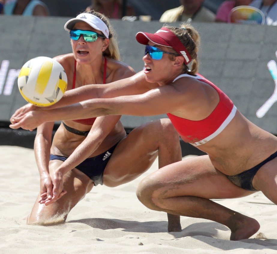
It would work really well as a High School Volleyball team uniform as, it seems that the closer you get to the Pro's the more... reavealing/Clingy/sexy the uniforms get. And, My goodness, my wife wore more to bed on our wedding night than you see on most pro beach volleyball courts:
Image provided from "156,000 fans watched talented up-and-coming and professional beach volleyball players compete on the hot sands of Hermosa Beach July 26-29", for research purposes only.
:)
Thank you :) Was the product you posted an edit as I didn't see it earlier? I don't have that one myself but it probably could be used and modified in a similar way to what I did.
When I first started looking for a match I was mainly only using the main image from the Wikipedia entry as my guide. Therefore, I was looking for "tight but not snug" and sleeveless t-shirt or wide-strapped vest (not sure if there is a proper name for that style). Obviously, as we have seen there are a variety of styles and sleeve lengths so that wasn't too important but it lead me to the "Gym Class TShirt" from this product. That appeared to be the right fit and had sleeves in a separate surface that I could just switch off (cutout opacity = 0).
Unless I missed it, there was no template files and so I pulled the highest contrast texture file into Illustrator and live-traced it to get the shapes of the front, back, sleeves and collar, adjusting the size a little bigger to add some bleed. The stitching I made by manually tracing along the existing lines with a dashed line on ones side and then copy and flip to the other side. In hind-sight I should have modified this to follow the design I made later as logically the stitching would be along the seems between blue and white, not where the front and back meet.
Then it was the case of making a design - for that I took the Japanese two-tone approach but used this forum branding for colours - thus creating the fictional "Daz Community College" team. So duplicating the traced shapes I made and for the top layer removing some points to allow the bottom layer colour to show at the sides. This did make the outfit look a little "flat" and so I also downloaded a free cotton texture - this one I think - turned the red to greyscale in Photoshop and overlayed it in illustrator with a darken transparency. That bit probably would not stand up to closer inspection but was good enough for an experiment.
Then for the personalisation I used this free font from FontSquirrel for the team name, numbers and names on the back - the names using the type-on-a-path tool applied to a curved line. Using layers there it makes it easy to duplicate for each player and also meant if I needed to change anything in the main detail it was easy to toggle the layer visibility to generate updated texture files.
As mentioned, sleeved or sleeveless can be toggled per player by using the cutout opacity on the sleeves.
The shoes and socks didn't seem overly important and so they are from the same above product.
The shorts from that outfit seemed a tad too loose so I used the ones from this Gym Wear Outfit. Nothing special done to those other than applying match colours from the top to the surface areas.
The knee and elbow pads were just taken from the Take Down Clothing Set with a generic black fabric shader applied. But as lou_harper mentioned you can probably use the Roller Derby ones too in the same way.
Then I finished it off with some Volleyball poses that I seem to have but not had a chance to use yet and since I didn't have a Volleyball court and also wanted to throw in the mirror to show the backs and fronts they are in an otherwise empty Yoga studio.
So, far too much effort just to knock up an example but it was also good kitbashing practice :)
Well, I imagine that suggests the main reason why these types of sportswear are considered more sellable than the indoor ones :P
Beach Volleyball tends to have considerably more revealing costumes for the female players than indoor volleyball. Must admit that I got the impression the OP was asking about the indoor game.
Regards,
Richard
Ha!
I said the outdoor volleyball uniform was for "research puropses"... just as a comparsion.... he he.
Sofa, you certainly went above and beyond for just a sampling... How about packaging it up and putting it in the freebie section? Pretty Please?
Hmmm .... well I think I can do that. It would obviously be a texture pack for the Gym Class product - I assume I can distribute files creating by livetracing one of the materials since none of the actual products files would be inside. I'd need to tidy it up a bit and figure out how to make a Daz package but as it turns out I have a few days off work now so I guess now would be a good time to learn that :)
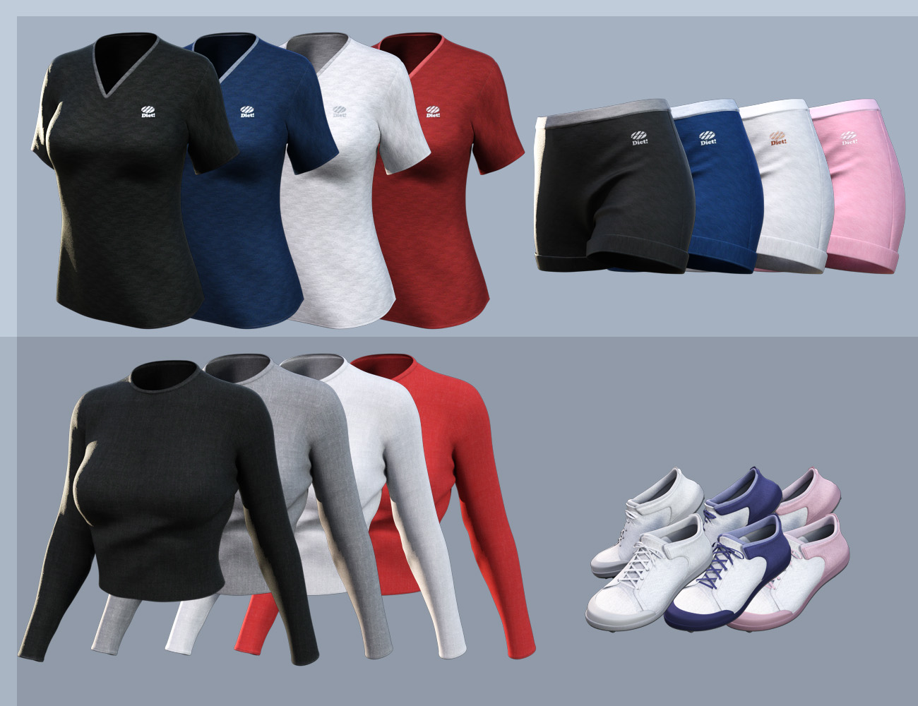
Not sure if you still want this but I have now finally packaged something up. It took longer than expected when I started, partially due to some other things that I had to deal with but also making a daz package is quite involved and somewhat fiddly. In short I have got rid of the branding, replaced the clothing texture overlay, added two more styles (so you can actually have a match or two), added backup textures for the shorts that come with the shirts, made duf files for everything, made a dsx file so you can import the Smart Content and added some documentation. Unfortunately, the zip file is 99MB so too big to attach directly to the forum and Renderosity didn't want it so I ended up self-hosting it.
Link is here
New promo image with the three designs below:
Epic!
Extremely well done!
Thanks a bunch!
Sofa...
What morphs etc did you use to get rid of the breast cling? I really like how #8 above turned out.
Thanks :) I created the original image without really noting everything I did seeing as it was just me messing about trying to build a quick mockup for the original topic - it's at times like these I wish Daz had a "history log" saved with a scene to remind yourself of what you did.
However, opening up the scene file again and taking a look - #8 is Dharma but with a few adjustments - specifically 39% on the "Breast Gone" morph and 25% "Breast Pointy" morph. I am not sure the best way to tell where a Morph is from but judging by the asset file paths in the parameter settings: I believe the first is a default G8F morph - certainly if not it's a Daz authored one anyway and the second is from Breast Utilities 1 by Soto. I have used the SY Clothing Breast Helper in the past to remove some shrink-wrapping but unless the currently used section is lying to me I don't think I used it here. Hitting clear on the simulation tab didn't change the look so no dforce adjustments were active and therefore I think it would just be the first two morphs I mentioned that created that fit.
Also, I think maybe 5% is due to the lighting and angle which is hiding a little bit of oddness that would otherwise need to be smoothed out if viewed at a head-on angle.
I hope that helps :)
Thanks!
That should get me started, my first simulation didn't look very good so I'll give it another try and tweek some